For me, writing and thinking go hand in hand. I have a difficult time separating the two. As a visual thinker and programmer, my writing tools rely heavily on graphical elements and logical, structured writing. These are the tools I use. They are deliberately not listed in logical or sequential order for the simple reason that I often write like a squirrel crosses the road.
Ulysses
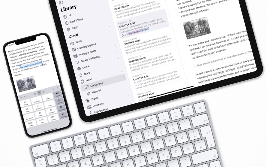
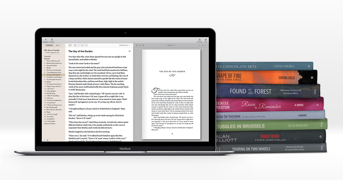
I have gone back and forth with this app over the years in a love-hate relationship. Well, maybe not love-hate, more of a love-confused relationship. But for writing my first novel, I find myself currently back with it, and in fact, I am writing this blog post now in Ulysses. As a structured writing tool for long-form writing, it’s pretty neat. Structured, organised, with almost all the tools you might need to write long-form. And it handles manuscript and book publishing very well indeed. I did consider the possibility of using Highland or Final Draft for long-form manuscripts, but although each of them can do it, I'm not really sure you'd want to. Ulysses has the chops. Then there is Scrivener of course. Goodness knows how many writers use this app, and indeed swear by it. But I just couldn't. It was like taking a step back in time. I am truly a romantic at heart, I savour antiquity, but not when it comes to software. So for long-form writing, this ended up being a one horse race, betting on a horse I didn't even want to win. But it did. Ulysses by a length.
Bear
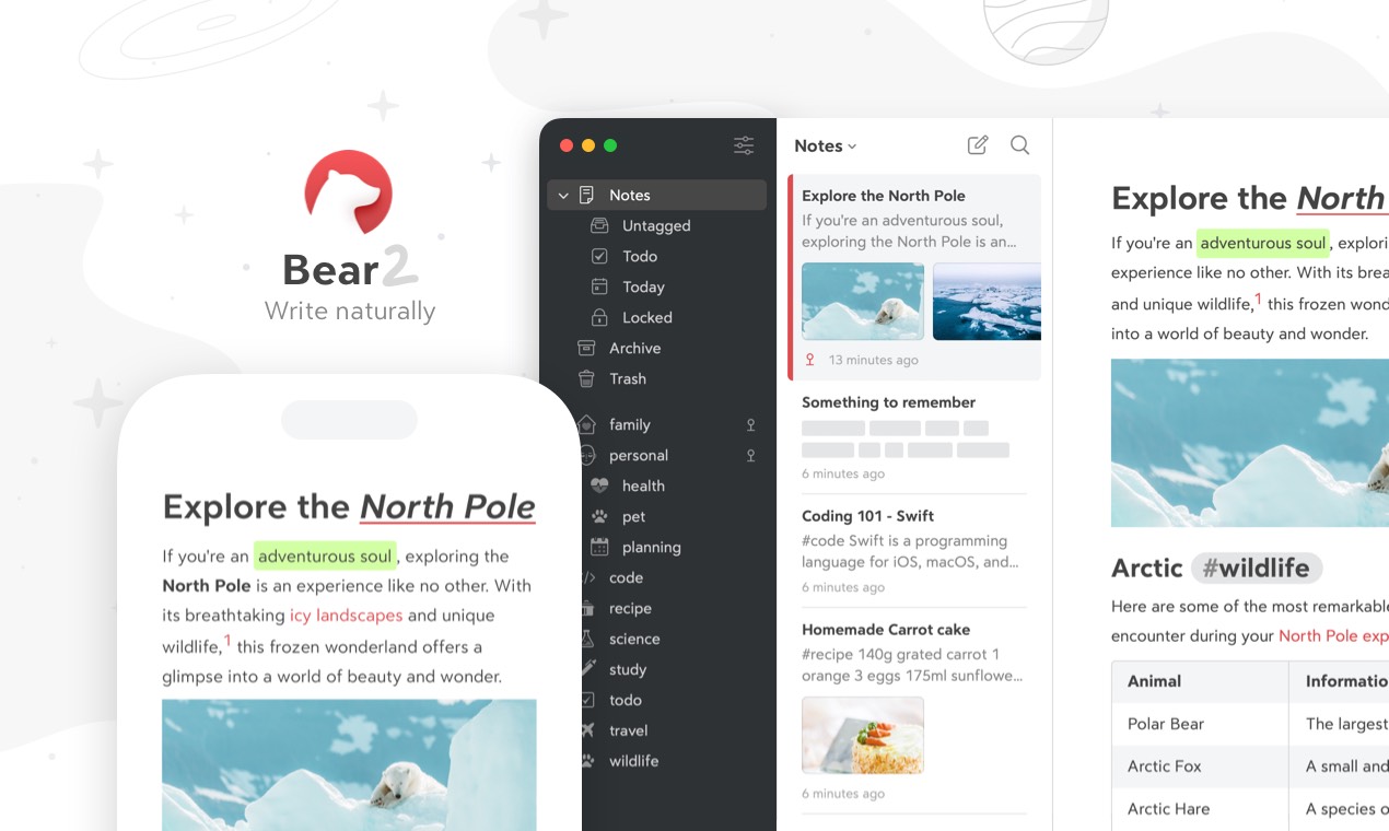
Bear is hands down my favourite note-taking app. It’s simple, elegant and is on every device I use. I couldn’t live without it. I did start out writing on this app, but it’s not suited to long-form writing. It has a clever tagging system but lacks support for structure. But it was never meant to be an app for writing. It was meant to be an app for note-taking and tagging. And it does that so well. And it is beautiful to look at and use. My favourite feature is the browser shortcut that allows me to capture a web page in Bear as a note. It works almost perfectly every time — what a time saver.
Final Draft

My first script was for a stage musical. I tried several, if not all, of the popular scriptwriting apps, trying to find the perfect balance between function and aesthetic — I don’t like working with ugly tools.
Throughout my research, I came across a great deal of deep-seated hatred for the big granddaddy of the scriptwriting scene: Final Draft. The hatred was so widespread and vehement in many of the writing forums that I took it at face value that this was an app I had to avoid. Plus, it was amongst the most expensive of the writing apps.
Then a funny thing happened on the way to the writing desk. After having gone through all the scriptwriting apps and finding minor niggles I either didn’t like or were showstoppers for me, I took the Final Draft demo for a spin. Bear in mind this was Final Draft 12, the version that had was released in 2021. Having toyed with Final Draft 11, I noticed a few things had changed. The new version had addressed many of the common gripes. A few new features along the lines of story building had appeared. None of them was stellar in design and would be far better served by third-party applications, so they were a moot point for me. Stability had appeared to have improved. Although on macOS Catalina, I experienced several crashes. But you learn. That’s what CMD+S is for. Use it or lose it.
Many people claim that the features in Final Draft are more suited to the production process than the writing process. And I would have to agree. Even tagging seems to be for the wardrobe and effects departments rather than for the writer. But then that funny thing happened. When it comes to writing in Final Draft, I enjoyed it. I found FD12’s predictive character name choices to be quite accurate and logical. And the standard font used by the app, Courier Final Draft, I started to enjoy. Very pleasant on the eyes.
And I had layout freedom. Musical stage plays are curious things to put on paper. There are a lot of considerations to be made over and above a movie script. Some fine scriptwriting apps just didn’t cut the mustard here.
Then there is the mobile consideration. Some highly revered scriptwriting apps don’t have any support for mobile devices. Some do, but the implementation varies from weak to unusable. On the other hand, Final Draft has its own Final Draft Mobile. I’ve used it many times when I am out and about, and it gives me a sufficient subset of tools to do some writing and editing between gulps of coffee. Stable. Rock-solid. Get’s the job done.
So, for the time being, I’m sticking with Final Draft. Honourable mentions however include:
Causality
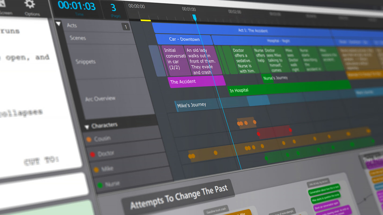
A logical block by block approach to story building based on cause and effect. It was almost too tempting to resist. I loved the idea. But something just didn’t gel with me about it, and I couldn’t quite figure out what it was. I wanted to use it so much but using it felt like, I don't know, awkward, clumsy? Almost as if the concept, as brilliant as it was, was getting in the way of the writing. But the concept still intrigues me, so I will be sure to make a return visit and take it for another spin.
Highland
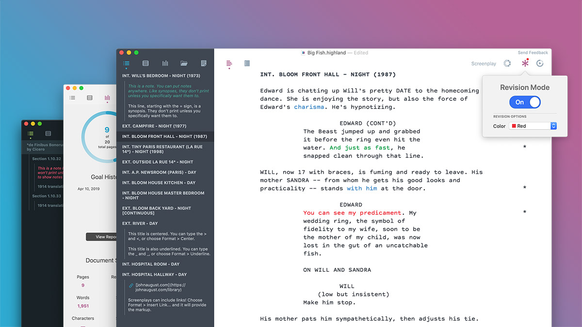
Simple, elegant, structured markdown writing. Beautiful to look at, lovely to use. But you are severely limited if you want to do anything outside of movie scriptwriting. No iPad version. I noted in their forums that there was constant talk of it, but like Christmas... Their forum, unfortunately, seems to nurture an element of resistance to new ideas, which is a pity because the app could reach a much wider audience if it was opened up. At the moment it's a kinda one-trick pony for scriptwriting. Fair enough, it's a beautiful application, and it was designed for one thing, which it does well. But mobile is where it's at. I doubt anyone is going to write a script on a mobile phone, but iPad? 12 inch iPad Pro? With a neat little Bluetooth keyboard? Better than lugging around a heavy MacBook Pro.
FadeIn Pro

Everything was right here except for the aesthetics and poor mobile support. The mobile app is there but is, by all accounts, unusable. Hats off to the developer though, he’s doing this all on his own and he turns out a solid product. If FadeIn Pro had the aesthetics and user interface of Highland, well, wow! That would be something to shake the market up.
WriterDuet
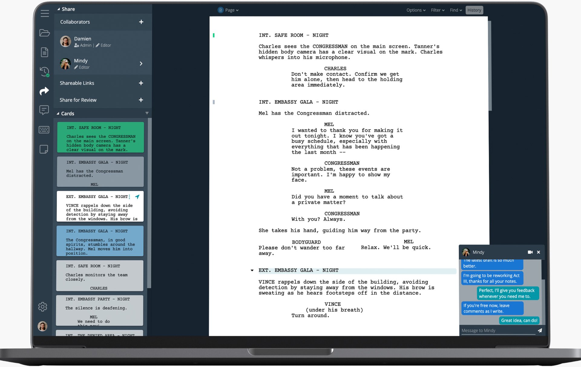
This is a pretty slick online app that's really aimed at collaboration. Having played around with it for a month I found it to be capable of most things. One of its strongest features is its ability to wind back every single word you ever type. Nothing is lost. Pretty impressive. And especially useful when collaborating I imagine. But I did find myself hunting around a sometimes too webby interface looking for that elusive menu item that I thought would be somewhere else. In the end, the subscription pricing put me off. While not extreme, it would only take a couple of years to cover the cost of the so-called industry standard, Final Draft.

Everyone knows Pinterest. No need to explain. A great way to kick off new ideas is to put together some images that represent the kernel of an idea I am working on. It’s amazing the ideas that leap off the page, or screen, when looking at a bunch of real people, real things, real situations. Needless to say, some of these boards would make interesting study material for an aspiring psychology PhD student, so I generally keep them private. It’s a bit like keeping a scrapbook as a kid. They inspire the dreamer in us all.
Workflowy

I played around with this app in the early days when it first came out and revisited it around five years later. As of 2021, it has come a long way. To call it a web-based outliner is a bit naff. Not just an outliner, it is an infinite network of bullet points that can be viewed as lists or boards that can be shared and mirrored. They recently added support for images and file uploads. I now find it indispensable for outlining the skeleton of a story. It’s on my mac and my mobile devices. If you are an ideas person, you can build things with this beauty of an app, even while standing in a queue in a supermarket.
MindNode

MindNode is my go-to brainstorming app. Enough features to make it useful and few enough features to make it light and easy to work with. And it works across all my devices. It has been a trusty tool for many years, but the development company has just gone with the dreaded subscription model. That and the fact that I now have several idea-building tools might mean that this app gets retired. We’ll see.
Aeon Timeline

Aeon Timeline is a timeline app designed by writers for writers. But the company appear to be broadening their target market. It has many great features, but there are now far better ways to do some of the things it promotes. But, and this is a big but, it does one thing really well. It manages time like nothing else. Anything that involves charting out who was born when, before someone else got murdered, at the same time as the butler broke his arm, etc. — well, this is the app for you. It will find plot holes for you. It won’t dig you out of them. But it will find them. Indispensable. Aeon Timeline 3 is supposed to be out this year (2021), and they are talking about some great new features that might make this app more useful for story plotting. So this app might get more of a workout from me when that happens. But in the meantime, for managing time constraints, it cannot be beaten.
Curio
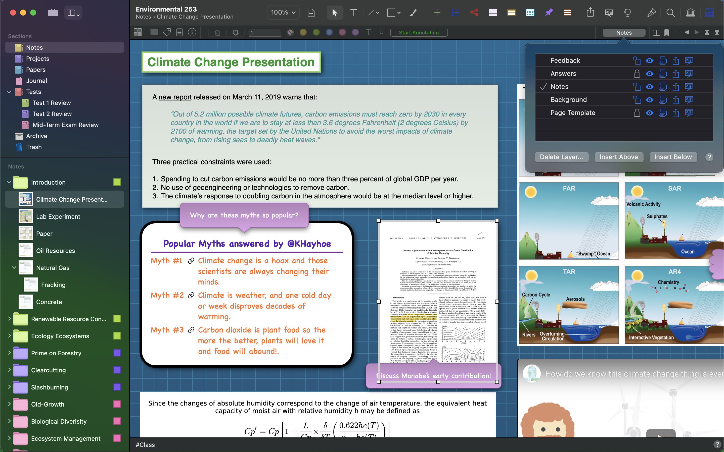
I used this app way back in 2004 to help build software projects. And then I forgot about it. It wasn’t until 2020 that I rediscovered it and couldn’t believe it was still being developed and maintained by the same guy. What is Curio? Ah, many things. Imagine taking a whole bunch of whiteboards, PDFs, web pages, sketches, documents, then tying them all together with links, tables, charts, and mind maps to make a composite document of your project. It is ideal for managing research. But I especially like using it when I can’t get my head around an idea I am trying to nut out in, say MindNode. When the whole visual concept needs to be a bit less structured to visualise and discover new associations and ideas, that’s when Curio comes into its own for me. A monster whiteboard on steroids.
PreWrite
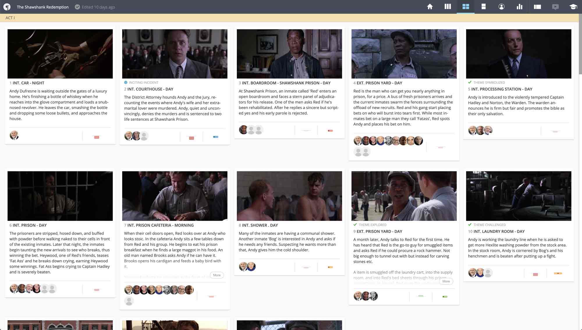
This tool is a recent discovery for me. When I first came across it I tried it I didn’t see its value and passed on it — big mistake. Pre-writing is what you do before you write the story. It’s not concept building. It’s not visually exploring ideas. It’s not even building a basic skeleton of a story. It is actually pre-writing the story. The story structure has already been built using other tools. Now it is time to visualise what the written story might look like. It is aimed primarily at movie scriptwriters, but the model can easily be applied to other forms of story writing. The closest analogy I can make is that we do a dry run beforehand when we sit exams at school. This method is called different things in different parts of the world. Where I came from, they were called Prelims — short for Preliminary Exams. What they accomplished was that they gave you a pretty good idea whether or not you were up to speed, whether you were going to pass the actual exams or not. And is there any signs of big trouble that could be fixed ahead of exam day? In short, is this exam process going to work or not?
Similarly, PreWrite, the app, exposes the whole structure of a story, plot lines, character definitions and character arcs in a way that asks us if this story going to work? Ultimately, most of what PreWrite achieves could be achieved using a spreadsheet and a slideshow, but with nowhere near the amount of aesthetic pleasure or surety of plot integrity that comes from looking at a glossy pre-written version of your story. PreWrite is a young tool, and they are just going through a crowdfunding round to raise capital for expansion. I can see a lot of great things happening for this start-up company. For me now, PreWrite is a must-have in my toolkit.
Other little helpers
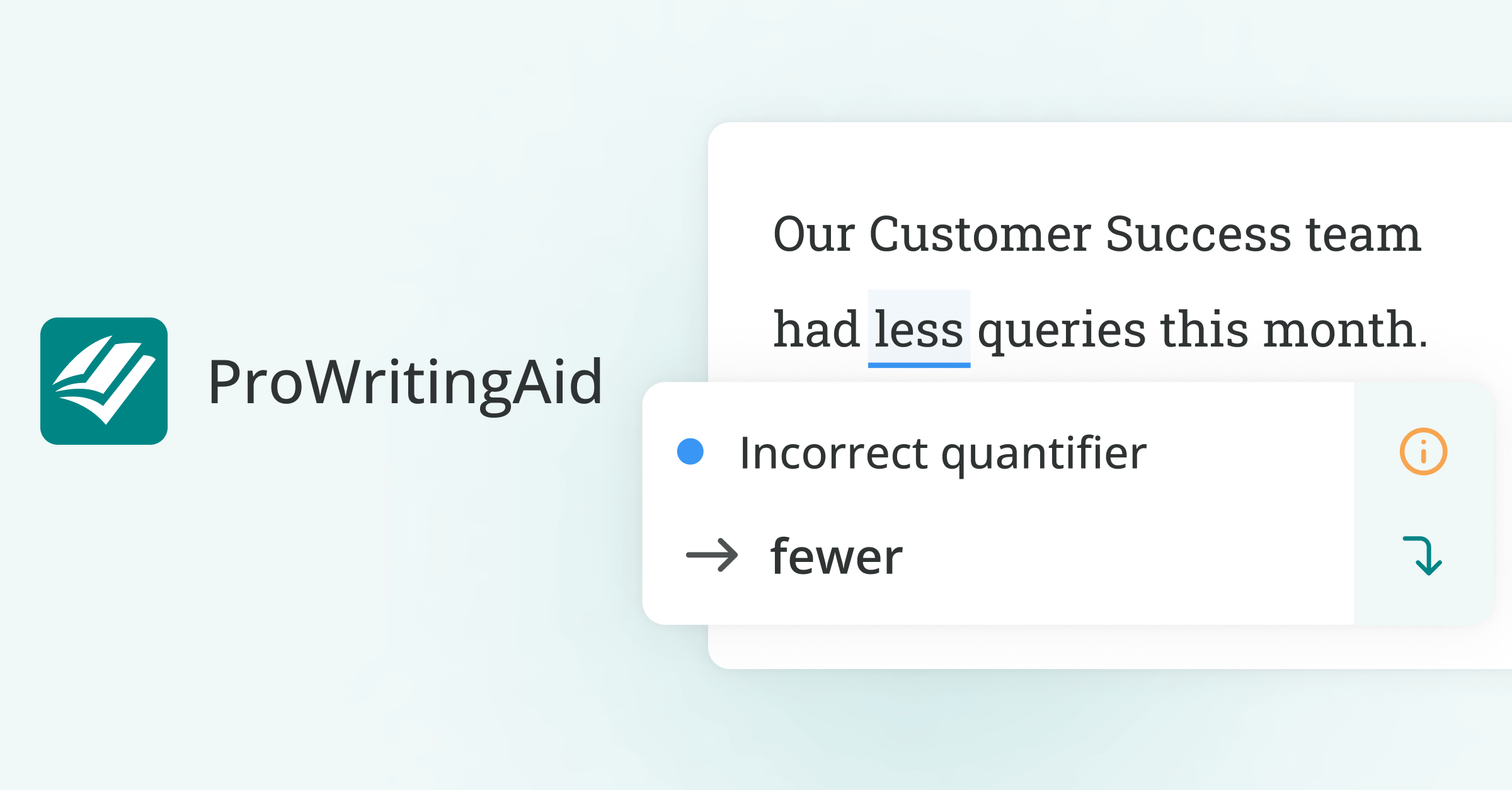
When it is time to call on the Elves for help, I call on these guys. Don't tell me you don't believe in Elves?









Member discussion: